Digital Portfolio

Over the course of the next few weeks, I will be creating a website that I aim to use as my digital portfolio. While my law school applications are already in, I will use this for future internships in the area of media law. I hope to attend law school to study intellectual property law, specifically copyright law, and a digital portfolio will be a great asset when applying to jobs in the media field.

While my audience will primarily be legal professionals, my digital portfolio will provide a distinct “edge.” In addition, it will be very relevant to my future career goals that include developing clearer laws and policies for digital media and copyright. The jobs and internships that I hope to obtain will most likely be related to digital media, and it will be important to showcase my skills.

My three goals of my digital portfolio are:

            1. Showcase my resume, writing samples, and qualifications

            2. Highlight my ability to display information in a clear and concise manner

            3. Emphasize my ability to utilize technology in a an effective way

I plan to include the following:

            1. Resume

            2. Writing samples from my internship in Brussels, Belgium

            3. Photos from my New Zealand study away, Brussels study away, and my two summer internships for Congressman Steve Daines

           4. Photo slideshow, podcast, and video project from this class

           5. Video of my final speech for public speaking, if still available

           6. Prezi presentation for my Government and Business Economics research presentation

I found several designs that I liked and hope to mimic.

The first one, Create Pilates, is how I envision my home page. I like the simplicity with only a few words and an image.Image


On Paul Landon’s architecture portfolio, I liked how the menu button was visible on all the pages that you navigated through. By clicking it, the menu to the right would pop out with the exact same options that were seen from the home page.Image

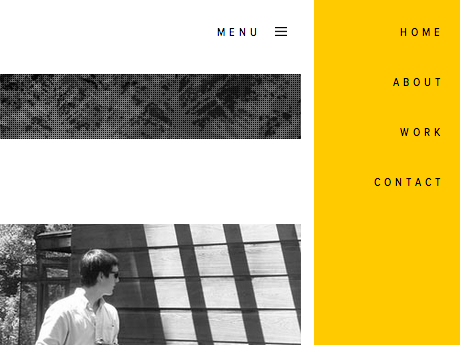
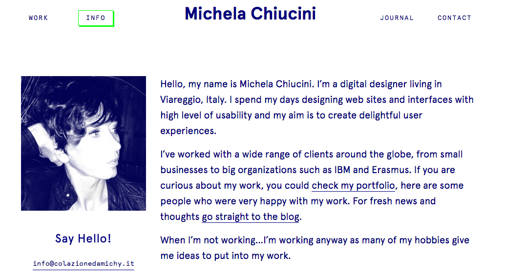
The next digital portfolio by Michela Chiucini has a nice introduction before listing her works. As simplistic as I want my website design to be, I think it is important to have a brief “about me” section.

Image

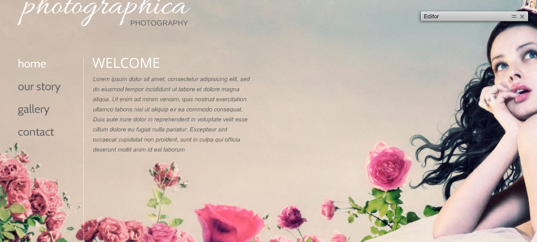
As awful as this next one looks, I am planning on using it for my overall layout. I like the simplicity of it, and with a new background picture and a brief welcome, I believe I can make it into a strong digital portfolio.

Image

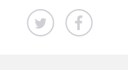
I like having miniature icons for social media. Although I doubt people will be tweeting or using Facebook to promote my digital portfolio, I want there to be links to other platforms that are small and tasteful.

 Image 


Audiences and the Web

Understanding the audience is critical in any rhetorical situation, especially when it comes to websites. The underlying challenge with the online world is that it is hard to identify exactly the type of person that uses your information. It is important to even understand details like audience emotions, values, technological capabilities, and social environments. Although difficult to capture exact information, there are ways to capture this data without ever talking to the individuals on your site. One common way to collect this information is through surveys or registration. Typically, at the very least, you can capture the ages and gender, which can help narrow down your site a little more.

In, “Writing Web Content That Works,” Redish states that in order to have successful web content, people have to be able to find what they need, understand what they find, and act appropriately on this understanding. If there is any disconnect between these areas, then the information presented will not be effective. One way to address this issue is to imagine a scenario for each piece of information on the web site. If you cannot imagine a scenario in which someone would need that information, then it is not useful and should not be included. The scenario helps you understand why the viewer is visiting your site so you can be better equipped to handle his or her individual needs.

It is also necessary to design pathways for the viewers to find the information. These pathways originate from the homepage. The point of the homepage is to identify the site, set the tone and personality, help people understand what the site is about, let people start key tasks immediately, and send each person on the right way. I decided to test this out with Furman’s home page, which has recently been redone.

Image

It is very easy to identify the site in this case—the purple school color and the title “Furman” definitely give that away. The upbeat pictures show that Furman is an upbeat and positive community, and the overall tone is excitement. It is relatively easy to understand what the site is about because there is an area for prospective students to visit as well as places for current students and faculty to sign in. Without reading anything, the user can find the tab that they want to click on and get started immediately. While I might be biased since I used this site multiple times everyday, I believe it is a good example of a clean and effective homepage. 

The User Experience

The iPhone is arguably one of the most prevalent pieces of technology in society, and it has infiltrated nearly every home in the United States. If people don’t have an iPhone or an iPad or an iPod, they know what it is, they know someone who owns one, and chances are, they are talking about getting one or wanting one. Walking around any public place, we can see everyone hunched over their phones, waiting for a text message or for Google Maps to load. How is it, though, that single piece of technology can change a culture?

Image

Jesse James Garrett argues that there are three basic “design” components of any given piece of technology: aesthetic design, functional design, and user experience design. A successful product, like the iPhone will incorporate all of these different components. A pretty, white rectangle is useless to carry around every day if it can’t make phone calls. A big clunky telephone with a cord makes phone calls, but it is impossible to fit in that cute handbag. Both aesthetic and functional designs must coincide. Often, though, we overlook the third component: user experience design. Selling a product is much more than selling a product—it is selling an experience, and as such, it must meet the expectations of the user. A lot of people were hesitant to switch to the iPhone because it is completely touch-based; however, the buttons are clear and the settings allow the user to manipulate the font size, making it an easy phone even for my grandparents.

In the video below, Steve Jobs discusses the idea of starting with the customer experience when designing a new product and then working back to the technology:

This user experience does not apply solely to physical products. It is very much applicable to online content, whether from a personal or professional site. An easy example of this is online shopping. I have certain sites that I frequent because they are easy to use on both my computer and phone, and I can easily navigate the different pages. Other websites, though, I avoid altogether. Nothing against the quality or style of clothes, but I simply don’t want to waste my time figuring out how to add an item to my shopping cart. It also takes away from the credibility of the company—chances are, I will not feel comfortable inputting my credit card information into a website that is mediocre at best.

Even with the aspect of personal blogs, though, it is important to make sure that the content is interesting, engaging, easily accessibly, and easy to navigate. Now that may seem like a tall order, but that is the way to keep your “consumers” returning to the site. One way to do this is by following Garrett’s recommended plane method: strategy, scope, structure, skeleton, and surface. Each layer depends on what comes beneath. We have to strategize the overall product before we can start to narrow down the scope and build the structure. We cannot build the skeleton until we have this structure identified, and finally the surface, what the users actually experience, is incorporated. We cannot have one without the other.

How do you think the user experience has changed as technology has progressed?

How is experience connected with user expectations?

Website Design and Publishing

The Internet is a central part of our every day lives. Each day we check out different websites—from social media sites to news sources to personal blogs and other websites. Brian Carroll discusses how this online convergence has blurred distinctions between different jobs on the web. People are simultaneously writers, editors, artists, and technology gurus. A website is so much more than just information—it is an entire argument that the reader and viewer must understand. There is no “standard” format, and instead, the author must sort through hundreds of templates to present the website in the most effective way.

Organization is a central key to this—the author cannot just write in a stream of consciousness flow, unless, of course, that is the intent. Instead, the author must have something that grabs the reader from just skimming the images. In addition, the images and the hyperlinks must be relevant, every single item on the website must add to the argument. Even things like consistency in bylines and photo credits help contribute to the overall effect of the website.

Website design does not go unrecognized. There is a website that is completely dedicated to giving awards for website design and creativity. Awwwards highlights sites of the day and sites of the month. Scrolling through the different websites, it is apparent that there is a lot of room for creativity on the Internet. Despite the differences, though, the websites all present strong, central themes and are easy to navigate. I clicked on the winner from April, and it took me to a website called “Into the Arctic.” Immediately, I understood the intent of the website from its opening page. In addition, the visuals and stories kept me on the site for a good ten minutes, despite the fact that I don’t necessarily agree with the goals of the website. It still had an amazing format, and it is clear why it was recognized for its website design.  

Overall, it is apparent that understanding how to format and create a website is crucial in the world today. With nearly everyone online, an effective design and layout can dictate whether or not people listen to what you have to say. It is important to look beyond the message and instead, also look at the overall presentation of the site.

Point of View

Imagine your favorite movie. Why is it your favorite? It is probably your favorite because you like the story, the quality filming, and the action. What if that movie, though, was told from a different perspective? I’m not at all saying that The Titanic is my favorite movie, but since I have used it as an example previously, I will continue with it.

Image

The movie is shot from the perspective of Rose, an affluent woman who is drawn to the rambunctious Jack. Much of the movie is spent in limbo as Rose tries to decide what she wants in life, torn between her roots and her dreams. Imagine if the story was told solely from Jack’s perspective, though? We would have no idea the internal struggle that Rose faced. In addition, we would not have walked away feeling as though The Titanic truly was a luxury ship. Plus, the movie would have been significantly shorter.

The point of view in a film can be defined in one of three ways:

            1. In film, specifically, the camera shot through the eyes of the character

            2. The perspective of storyteller

            3. The interests, attitudes, and beliefs associated with a character’s perspective

First person perspective is best established with voiceovers, but it fails if it is used for too long. Second person is less frequently used and is seen most often in how-to-videos. Finally, third person is most common in story-telling, especially in film.

Now this is a stretch, but in Washington, D.C., there is this great spot for drinks called the P.O.V. Lounge, or Point of View Lounge. You sit on top of a roof in the middle of the city, overlooking most of the monuments and federal government buildings. At first the name just alludes to the fact that you have a great view of the city, and I have no doubt that is true. Ultimately, though, it is a little suggestive that you are above all the important buildings of our country, looking down from your perspective. When you look at the White House, you probably make connections with things different from the person sitting next to you. They may see it as a historical landmark, someone else might see it as a symbol of our nation, and someone else may see it as a political statement.

We all bring different views and perspectives to the table, and it is part of the nature and artistry of a film that those views and perspectives are adequately portrayed. An effective understanding of point of view can truly help determine a film’s success or failure. 

Editing Videos

In “The Aesthetics of Editing,” Osgood and Hinshaw discuss the importance of editing. Editing, they claim, is what ultimately ties a story together. We can think back to almost any movie we have seen recently. We might have liked it because of the actors and actresses in it, but more than likely, a lot of our draw to the movie came from the fact that it was well edited. The soundtrack, the action, the cinematography was what made it interesting to watch. As much as I love Leonardo DiCaprio and could watch him act in almost anything, we can all agree that his performance in The Titanic would be undermined if it were void of “My Heart Will Go On” by our girl, Celine Dion, or if the camera only captured one shot of the ship sinking instead of the entire vessel falling into the sea. Sorry if I spoiled the ending for anyone.

It is amazing to me what someone can do with editing. If you watch the fake previews for The Titanic 2, you will see what I mean. This shows different clips of videos that Leonardo DiCaprio has starred in put together as a fake sequel. This type of video was made possible by many cuts and similar action shots as well as an effective soundtrack.

I loved what Louis Malle, a director, said of his editors, “I keep telling [them], if you win an award for editing, I won’t work with you anymore. Your editing shows.” This embodies the idea that all the storyboarding and the thinking that goes into camera placement and angles is not supposed to be seen by the average viewer. When I did a month long study away trip to New Zealand my freshman year, we had the opportunity to visit Peter Jackson’s studio. We got to see where the director and his staff sit to preview a movie and see how the edits are coming along. The amount of work that goes into a single film is nothing short of impressive. The reason for the meticulous nature of it is that no one is supposed to know.

This article goes into continuity, sequencing, montages, cuts, and other various techniques for editing. As I was reading through it, I began to visualize what types of edits would be necessary for my upcoming video project. Since my video is about exercising, I am anticipating lots of motion. It is going to be important to have action even while my interviewees are talking simply because of the topic at hand. Stay tuned to see my final video project!

The Power of the Frame

In Zettl’s article, “The Two-Dimensional Field: Forces Within the Screen,” we learn about specific ways to enhance images by understanding the makeup of the screen itself. We can all remember a time when we went to upload a picture as our profile picture or cover photo and regretted the fact that we took a vertical or horizontal picture. The cover photo is designed for more of a horizontal photograph, and in this article, when discussing the differences between vertical and horizontal, it made sense. The horizontal picture suggests a more calm and serene scene. Even a dramatic event, when spread across a horizon, can seem tranquil. When looking at most of our friends’ cover photos, they are usually composed of landscape scenes or big groups of people. The profile picture, though, is where all the action is. Chances are, most people on Facebook have at one time or another had some sort of action shot as a profile picture.

In the images below from my Study Abroad, you can see the differences between vertical and horizontal photos of the same cathedral in Normandy. Imagine if they had been switched? Would the same image have the same effect?

ImageImage

When reading this article, I could not help but apply it to my upcoming video project. I started to think about how I can frame my shots. Since my video is going to be on exercise and individual training, there is going to be some action, and by having awareness about the direction of movement and image weight, I will be able to intensify the actions.

As I thought about filming, I immediately about the new trend of GoPro cameras. As an avid skier, I grew up going to the mountain every weekend during ski season. In the past few years, I have noticed more and more skiers and snowboarders sporting these tacky cameras on their helmets. I could not help but think of how poor that footage must be. Despite being an action-packed activity, the camera just portrays a rough ride down a mountain. This article discussed the importance of a stable horizon and showed how specific movement in a particular direction is more impactful. While the GoPro does offer cool bragging rights and some hilarious Facebook videos, it does very little in engaging the audience in an action-filled event for the average GoPro user. 

Do You See What I See?

Digital Technology consumes our lives. From texting our friends constant updates to sending selfies throughout the day to updating our blogs, our Facebook pages, our Twitter accounts, and our Instagram profiles. Our lives consist of this constant “scrolling” as we scroll through website after website, social media platform after social media platform, trying to “connect” to those around us. Paul Virilio does very little to hide his disdain for what he perceives as the future of real human interaction.

When reading Part III of Open Sky, I could not help but think about how much technology has changed in recent years. I thought about Google Maps, which we discussed a little in class last week. Although you are certainly not experiencing culture through the 3 dimensional view of a street, you are able to see an entire city, without ever once leaving the comfort of your home. Virilio goes on to point out that technology is so advanced that it is becoming increasingly difficult to distinguish between computer generated images and real ones.

One profound point that Virilio brought up was the difference between freedom of expression and freedom of perception. He asked, “are we free, truly free, to choose what we see? Clearly not. On the other hand, are we obliged, absolutely forced against our will to perceive what is first merely suggest then imposed on everyone’s gaze? Not at all!” (95). To what extent do we see what we want to see, and to what extent do we see what others want us to see? Especially with the increased use of technology, people give us the exact images that they want us to see. For example Instagram is filled with images that an individual selects to show off their life. They are giving their audience an image, but it is in a controlled setting that the audience is “obliged” to see.